Every IT professional would agree that UI/UX design is not only about a fancy appearance.
Whether you gain a new satisfied customer or leave one looking to your competitor depends on whether you have created an intuitive and useable interface.
Why is this necessary?
In the digital era, when products and services are sold online, the interface plays the role of a sales consultant. Your client makes a decision partially based on their personal experience interacting with the interface. That's why we should treat this matter as carefully as we do the selection of people for our sales team.
To make the task simpler for you, we've prepared a set of basic rules that will help you assess the “professionalism” of your virtual sales representative.
1. People Scanners
People don't read. They scan. Users are lazy; they aren’t going to read through all of your content to find the solution they need. They simply click whatever seems the most suitable.
The Gutenberg Diagram illustrates how users actually explore the page. It divides the screen into 4 areas that receive a different portion of user attention.
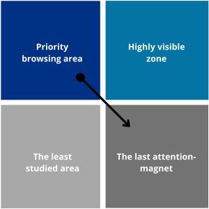
- The upper left area is the priority browsing area. The human eye is naturally drawn to it. Put the most important information about your company here (e.g., logo, slogan, etc.).
- The upper right area is a highly visible zone. When exploring the page, we move our eyeballs from left to right. This area is less important than the first one, but it still gets a lot of attention. Place elements like contact forms, buttons, and the search field here.
- The lower left area is the least studied area. We pay almost no attention to it.
- The lower right area is the last attention-magnet. We review it before leaving the page, and this is where the most important things happen. Place a call to action or an order button here.
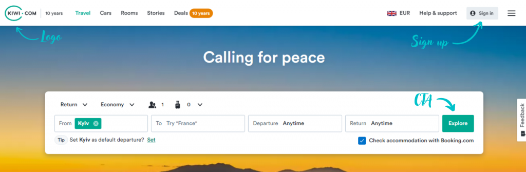
The kiwi.com website is a good illustration of the principle:
Important note: For right-to-left languages, simply mirror the rule.
2. The KISS Principle
KISS is an acronym that stands for "keep it short and simple," or, our preference, “keep it simple, stupid." This principle is the main dogma of UI/UX design.
It says that the interface should be simple and intuitive while the functionality of each element should be obvious. The app should be built in such a way that the user moves from point A to point B with minimum effort, both physical and mental. Otherwise, you'll make them feel frustrated subconsciously, and they'll leave your app shortly.
The drag'n'drop feature is a good illustration of the principle. This is an absolutely natural and easy to perform action with obvious result
3. Don’t Make Me Think
This is the name of the 3rd principle, as well as the title of a book written by Steve Krug, the world famous UX consultant.
It says that the fewer number of actions required from users to reach a certain goal, the more likely they’ll do it. People who are only exploring your site don't want to dig through massive amounts of text or fill out long forms. Give the prospect an opportunity to try your product without sharing a lot of personal information. Maybe they'll end up being motivated enough to give you more for your service.
4. Fitts’s Law
The easier it is to find a target and the shorter the distance to it, the faster and easier it will be to move to that target.
In other words, the rule illustrates the connection between the size of an element and the distance to it. The main goal of this principle is minimizing the time required to click on the target element.
The law has 2 consequences:
- Make the target elements larger so that they will attract user attention and be easier to click.
- Shorten the cursor movement by placing related elements close to each other, thus making it easier for a user to navigate between them. Drop-down menus are a good example of this rule.
5. Hick’s Law
Have ever you noticed how hard it is to select a yogurt standing next to a huge stand in a supermarket? The same is true for an interface. The greater the number of choices, the longer and more stressful the decision-making process will be. Indeed, more choices increase the chances that a user will decide that none of the options are suitable.
Therefore, limit the number of options to a few of the most popular ones and hide the rest for the joy of the few clients who love to explore.
Check out a related article:
7 Hottest Web Development Trends in 2022-23
6. Signal to Noise Ratio
A signal is what we call useful information.
Noise is all of the unnecessary elements that blurs the signal.
Find the optimal ratio between these factors to create an intuitive and pleasant design.
Remove redundant data or emphasize important elements to streamline your navigation.
But don't neglect some noise. A fully minimalistic design is ok in some cases, but it will make people feel uncomfortable in others, so feel free to add some secondary elements. Some noise will add charm to the design. Just make sure it doesn't block the signal.
7. Clear communication and UX writing
Your design’s "visual language" can be a friend or foe. Here are 3 simple rules that will help you use it as effectively as possible:
1. Organize the data
Provide your users with a clear and coherent structure. Logical blocks, including their placement, interconnection, and navigation between them, should be intuitive and smooth.
2. Don't waste characters
Do as much as possible with fewer elements. If you can replace a sentence with one word, do it. If you can use an icon instead, don't hesitate.
3. Don't pile on styles
Select a primary and a few secondary colors for your design. Try not to use more than 3 fonts; otherwise, the design will look messy.
UX writing is worth a separate article of its own. Luckily, we've got one! Enjoy it here.
8. "Miller’s Purse"
In 1956, American psychologist George Miller found that human short-term memory can store no more than seven pieces of information (+/- two); this is our mental "purse."
We often do not perceive the meaning of elements, only their basic visual characteristics. Long story short, which elements we store isn’t important. Only the number of elements is important. If the number increases the limit, we start dividing the elements into subgroups.
This rule has some takeaways for software designers. For example, it's always a good idea to replace a long menu with a short one with drop-down elements.
9. Theory of Proximity
Grouping together related elements is a good way to facilitate navigation for users. Good examples are the "Open" and "Save" functions, which are like a fork and knife combo. Grouping should be smart. You can't just place random elements next to each other.
Here are the 4 golden rules of smart grouping:
- General area – A user should perceive a page as a holistic structure. Most often you achieve this by creating the background.
- Connections – If elements are visually linked together, users perceive them as whole.
- Similarity – Site elements should share common colors, fonts, and shapes.
- Proximity – The closer the elements are, the more interconnected they seem.
10. Principle of Bridge Railings
Otherwise known as the "foolproofing" principle. Protect users from actions they should not do. For example, hide advanced settings or don't highlight non-clickable elements.
And last but not least – follow trends, but don't forget classics
Some trends were introduced to address specific needs (e.g., the hamburger menu), while others are just as a popular industry feature.
Follow the trends to ensure your product looks fresh, but do it wisely. Before introducing a new fancy feature, think about how will it affect the usability and overall look. Sometimes, a good but old standard will work better—especially if your audience is conservative.
Think of your users, and you will gain their loyalty!
And if you need more expert advice from an experienced UI/UX design company - don't hesitate to contact us. We're always happy to help!
Leave a Comment