We are continuing our series of articles about the latest UX trends with the one that may seem to be really unapparent and far from the design & development process: UX writing. However, after reading the article, hopefully, all of your confusion will disappear.
If you missed the first article of the series, you can find it here.
“Writing is easy. All you have to do is cross out the wrong words.”
Mark Twain
The sales copy age is coming to an end. Customers are fed up with businesses trying to persuade them to buy their product; they want to become convinced by themselves via outstanding user experiences. This is how copywriting got driven out by UX writing.
UX writing lies in creating copy that will lead the user through the product and assist in their interaction with it. Examples of UX writing are labels on buttons and in menus, security and error messages, guidelines, and terms and conditions policies. These texts are the units of UX writing known as microcopy.
Importance of Microcopy
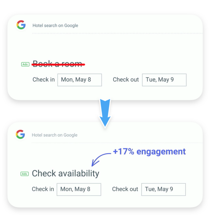
At an annual Google I/O conference, Maggie Stanphill, senior UX writer at Google, explained how well-planned UX copy can bring value to businesses. For instance, after changing the call-to-action on the booking button label in one of Google’s services, the engagement rate increased by 17%.
“We found that it was far too committal at this stage in the decision-making process. So, we switched it to ‘check availability,’ and what we found was that this was meeting the user where they were in their mindset. They were still considering rooms, and they wanted to understand what dates were available, and what prices were in that date range.”

At first glance, this change may seem minor, but the result shows that improving your microcopy is worth a try. In the end, the labels you have will either make the experience flawless or break it down. No matter how perfect your interfaces are, if they are “embellished” with confusing, fallacious, or misspelled texts, users will be disappointed.
How to test microcopy?
But, how can you find out if your microcopy works well or needs to be changed? Below you can find a concise list of do’s & don’ts that will help you to evaluate your UX copy.
|
DO’s |
DON’Ts |
| Be concise and precise.
e.g., Log in to comment. |
Avoid long blocks of text.
e.g., You must log in before you can write a comment. |
| Begin with the objective.
e.g., To see an item’s properties, tap on it. |
Don’t use double negatives.
e.g., I do not want to unsubscribe. |
| Make the copy consistent.
e.g., Change your preferences in Your Account (not “My Account”). |
Avoid jargon.
e.g,. System error (code #2234): An authentication error has occurred. |
| Write in present tense and active voice.
e.g., Click the Search button to search for an article. |
Don’t joke too much. |
| Use numerals.
e.g., You have 2 missed calls (not “two”). |
Don’t underestimate graphics. |
This list is a short guide to create better microcopy, but if you aspire for perfection, you may need to ask a UX writer for help.
Who is a UX writer?
Shortly, UX writers are the ones who stand behind those tiny but valuable texts.
If a copywriter writes text in order to draw the attention of potential customers, UX writers mostly work with existing ones. Their task is to create an experience that is good enough for current customers to continue using the product. This can be harder than just engaging someone to try out a product. While copywriters work in tandem with marketers, UX writers work hand-in-hand with UX designers.
Some typical responsibilities of a UX writer may include the creation of the following:
- Copy within products and websites
- Brand books and style guides that specify rhetorical strategies and tone of voice
- Content strategies
- Data research necessary for content strategy
So, what do UX writers actually do?
- Collaborate with design and development teams from an early stage
- Research target markets to find out how users naturally speak
- Offer hypotheses regarding the product's UI, and run a/b testing
- Work with Marketing and PR teams to create and follow the company's brandbook
- And, of course, write perfect copy
So, now you can see that good UX goes far beyond a nice appearance and a logical structure. It unites many factors that, together, make what we call a good user experience.
If you need help or a consultation with a UI design expert, feel free to contact us. We'll gladly give you a hand in making your product's interface engaging and joyful for users.
Leave a Comment