
In a consumer application, poor user experience often announces itself quickly. People abandon registration, uninstall the app, stop buying, or leave a bad review. In a B2B SaaS platform, the evidence is usually less convenient.
The user may have no authority to choose another product. A procurement team may have signed a multiyear contract. Administrators may have spent months configuring the system. IT may have connected identity providers, APIs, data pipelines, and internal systems. Managers may have built reports and operating procedures around it. Thousands of employees may already have been trained.
Under those conditions, users frequently continue using software they find difficult. That does not mean the SaaS user experience is working. It means the cost of failure has been redistributed.
Nielsen Norman Group makes precisely this distinction in its CASTLE framework for workplace applications. Traditional measures such as adoption and retention become less informative when employees are required to use a product as part of their job. NN/g therefore recommends looking more closely at cognitive load, advanced-feature usage, satisfaction, task efficiency, learnability, and errors.
That is the central economic problem with B2B SaaS UX: friction can survive without producing immediate churn.
Instead, somebody absorbs it.
The user spends another minute completing a task. A manager maintains an Excel tracker because the official dashboard is difficult to trust. A customer-success manager runs another training session. Support explains the same configuration issue for the hundredth time. An operations team corrects malformed records. Engineers build another customer-specific exception. Sales needs an additional demo because prospects cannot understand the workflow. Eventually a renewal becomes harder to defend.
Poor UX, in other words, behaves like an operating tax.
The most useful way to think about its economics is:
UX friction → additional user effort → lower task success or adoption → support, training, workarounds or manual intervention → weaker realized value → higher operating cost and retention/expansion risk
None of those arrows should be interpreted as automatic causation. Product-market fit, pricing, reliability, implementation quality, organizational change, customer maturity, competition, and many other variables affect SaaS outcomes. But UX is one of the mechanisms through which software either converts product capability into customer value - or fails to do so.
Why Poor UX Is Harder to See in B2B SaaS
Enterprise software separates roles that consumer products often combine.
The economic buyer cares about ROI, compliance, commercial terms, integration risk, and strategic fit. The administrator cares about configuration, provisioning, permissions, auditability, and keeping the tenant running. A manager cares about visibility, governance, reporting, and team performance. The end user cares about getting a job done accurately and efficiently.
These people can have very different experiences of the same product.
A CRM may satisfy the VP Sales because the company now has standardized pipeline reporting while frustrating account executives who must enter the same information into several fields. An HR platform may satisfy procurement requirements while forcing HR administrators to manually repair provisioning exceptions. An analytics platform may impress an executive during a dashboard demonstration while analysts export data to spreadsheets for the work that actually matters.
This separation helps explain why account-level retention cannot be treated as a complete measure of enterprise SaaS usability. As NN/g notes, retention is particularly problematic as a UX measure for software employees are obliged to use.
The commercial structure of B2B SaaS can hide the problem further. ChartMogul's research across more than 2,100 SaaS businesses has historically found materially stronger net retention as average revenue per account rises; its data also shows how important expansion becomes in higher-value SaaS relationships. That research says nothing about UX causation, but it illustrates how B2B customer economics differ from low-commitment consumer subscriptions. More recent ChartMogul research found that, among $15–30 million-plus ARR companies in its 2024 dataset, expansion contributed about 40% of growth, up from 30% in early 2021.

For a SaaS operator, this means a customer can remain contractually retained while becoming operationally dissatisfied.
The early signals may instead be growing implementation effort, weak feature penetration, recurring support requests, spreadsheet exports, customer-specific processes, low administrator confidence, repeated training, and a widening gap between licensed capability and actual workflow adoption.
The B2B SaaS UX Cost Chain
A practical B2B SaaS UX model should therefore follow costs beyond the interface.
| UX problem | What users do | Operational consequence | Financial consequence |
|---|---|---|---|
| Confusing onboarding | Ask for help, postpone setup, skip configuration | Longer implementation and time-to-value | Higher onboarding cost; delayed value realization |
| Poor information architecture | Search repeatedly, memorize paths, ask colleagues | Longer task time and training | Productivity loss; support demand |
| Unclear feature discovery | Keep using familiar basic workflows | Advanced capability remains underused | Product investment generates less customer value |
| Weak forms and validation | Enter incomplete, inconsistent or incorrect records | Rework and unreliable downstream data | Operations cost; weaker reporting and automation |
| Complex permissions | Open tickets or over-provision access | More admin effort and security risk | Support cost; implementation friction; governance exposure |
| Workflow mismatch | Export to Excel, email or Slack | Duplicate systems of record and manual reconciliation | Labor cost; data-quality cost |
| Inconsistent UI patterns | Relearn behavior across modules | More errors and customer questions | Support and training cost |
| Slow or fragmented workflows | Wait, refresh, duplicate work | Lower throughput | Customer productivity loss |
| Customer-specific exceptions | Vendor builds patches and special logic | Product fragmentation | Engineering and maintenance cost |
| Poor trial/demo workflow | Buyer cannot validate value independently | Additional sales intervention | Longer sales cycle or lost deal risk |
| Persistent usability debt | Humans compensate indefinitely | Hidden dissatisfaction | Renewal and expansion risk |
The important distinction is between visible UX defects and economic UX effects.
A poorly named button is a design issue. A poorly named button that causes thousands of users to choose the wrong operation, generates support tickets, corrupts workflow state, and requires engineers to implement compensating safeguards is a business-system problem.
That is the level at which SaaS leaders should investigate UX.
Where SaaS User Experience Converts Into Cost
Longer Onboarding and Time-to-Value
Enterprise SaaS onboarding is rarely equivalent to completing a signup wizard. Depending on the product, activation may require importing data, configuring a tenant, setting roles, mapping organizational structures, connecting identity systems, configuring integrations, defining workflows, inviting users, completing compliance steps, and training different personas.
Every confusing step increases the probability that somebody will require assistance or defer the work.
The economically relevant measure is therefore not merely “onboarding completed.” It is time-to-value: how long it takes an account or user to reach the first meaningful outcome that justified buying the product.
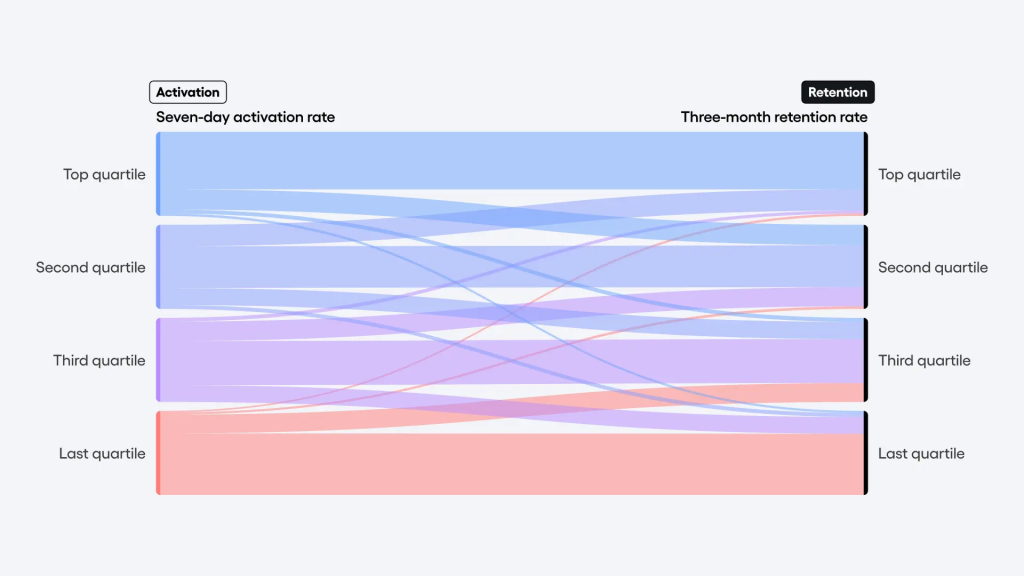
Amplitude defines time-to-value around the period between starting product use and reaching meaningful value, distinguishing that from merely completing an activation event. Its B2B benchmark analysis uses anonymized behavioral data from more than 2,600 companies. In that dataset, 69% of products showing strong early activation were also strong three-month retention performers. Amplitude itself describes this as a correlation, and it should be interpreted that way—not as proof that changing onboarding alone causes retention.
That distinction matters. A product with strong product-market fit can have both good activation and retention. Larger customers may receive more implementation help. Successful products may simply invest more effectively across the entire lifecycle.
Even so, onboarding remains a useful diagnostic point because it exposes how efficiently the product converts purchased capability into operating behavior.
For a fintech SaaS platform, consider the difference between “customer created an account” and “compliance team successfully processed its first KYC review using configured policies, queues, roles, and audit logs.” For an ERP, the milestone may be the first completed purchase-to-pay process. For CRM software, it may be the first opportunity moving end to end through the organization's real pipeline with accurate reporting.
Those are value milestones. A checklist is not.
Teams should therefore track onboarding completion together with setup time, implementation interventions, administrator time, training hours, failed configuration attempts, integration blockers, and time to the first repeatable business outcome.
There is no credible universal benchmark saying a B2B SaaS product “should” activate customers in a particular number of minutes or days. The underlying jobs vary too much. A self-service project-management tool and a regulated healthcare platform are not comparable. Using an arbitrary onboarding benchmark can be less useful than comparing segments, cohorts, implementations, and versions within the same product.
Low Feature Adoption and Wasted Product Investment
A second hidden cost appears after activation: customers technically have features that they rarely incorporate into their workflows.
Pendo measures feature adoption by looking at the number of features responsible for 80% of a user's click volume. In its published benchmark, roughly 6% of features generated 80% of clicks for the average product.
That number requires careful interpretation. It does not mean the remaining 94% of features are never used. It shows that interaction tends to be highly concentrated. That distinction matters because a simplistic “most features are wasted” headline would misrepresent the metric.
Still, concentrated use creates an important product question: is the long tail of capability appropriately specialized, or did the organization spend heavily building functionality that customers cannot discover, understand, configure, or fit into their work?
Feature adoption should therefore be evaluated by persona and intended use. Pendo itself recommends distinguishing breadth, depth, time to adoption, and duration of adoption rather than collapsing usage into a single metric.
Imagine a CRM that has excellent automated follow-up sequencing but most sales representatives continue creating reminders manually. The cause could be weak discoverability, poor setup UX, distrust of automation, missing permissions, an unsuitable workflow, or a genuine lack of customer value. Analytics cannot tell the team which explanation is correct. It identifies where research should begin.
The product-cost implication is significant because low adoption creates two forms of waste.
The first is historical: engineering, design, QA, documentation, enablement, and support effort have already been invested in functionality that produces limited realized value.
The second is prospective: instead of fixing the adoption barrier, teams may build more features around the same weak foundation.
A feature-adoption problem is therefore not necessarily an argument for more in-app guidance. Sometimes the correct intervention is simplifying configuration, changing the workflow, improving default behavior, integrating the feature into a core job, redesigning permissions - or removing capability that never justified its complexity.
Support and Customer Success as Human UX Layers
Many B2B products are easier to use than their interfaces suggest because humans compensate for them.
Implementation consultants configure accounts. Customer-success managers explain terminology. Support agents translate error messages. Solutions engineers demonstrate obscure workflows. Operations teams repair imports. Professional-services teams customize defaults.
These people provide valuable services, especially for genuinely complex deployments. The problem begins when they repeatedly compensate for avoidable product friction.
A useful distinction is:
Value-added service helps a customer solve a genuinely complex business problem.
UX compensation helps a customer operate software that should not require human intervention for that particular task.
If every new enterprise customer needs help mapping a sophisticated accounting structure, that may be legitimate implementation work. If every administrator needs a call to discover where billing contacts are configured, the service organization is functioning as navigation.
Support economics should be measured using the vendor's own costs rather than questionable universal “cost per ticket” benchmarks. Ticket complexity, compensation, geography, escalation rate, channel, and staffing model vary substantially.
A simple model is:
Annual UX support cost = UX-related tickets per month × fully loaded cost per ticket × 12
Then add customer-success meetings, implementation interventions, training, and engineering escalations associated with the same friction.
Support data is particularly useful because it reveals where SaaS usability problems repeat at scale. Ticket categorization should separate defects from comprehension problems, permission problems, configuration problems, workflow questions, data-repair requests, and “how do I?” questions.
The objective is not to eliminate support. It is to stop paying humans forever to compensate for predictable design problems.
Productivity Loss Multiplied Across Customer Organizations
A twenty-second delay rarely looks like a strategic problem in a usability review.
Multiply it across a high-frequency enterprise workflow, however, and the economics change.
Consider a hypothetical calculation, not an empirical industry benchmark:
A workflow requires 45 unnecessary seconds each time it is executed.
It is performed eight times per day by 600 employees across 220 working days.
That produces:
45 ÷ 3,600 × 8 × 600 × 220 = 13,200 hours per year
At a hypothetical fully loaded labor cost of $55 per hour, the customer's annual productivity cost is approximately $726,000.
No individual user experiences a $726,000 problem. Each experiences 45 seconds.
That is why workflow frequency matters so much in B2B SaaS product design.
External research reinforces the need to look beyond satisfaction, though vendor-produced productivity estimates should be treated cautiously. WalkMe's 2026 State of Digital Adoption research, based on 3,750 enterprise executives and workers, estimated 51 annual workdays per employee lost to software and AI friction. This is a vendor-sponsored survey estimate, not a causal benchmark that should be inserted directly into an ROI model. It is better treated as directional evidence that organizations perceive material friction around enterprise tools.
For a product team, direct telemetry is more valuable.
Measure the customer workflow itself: successful completion time, retries, waiting time, repeated navigation, unnecessary data entry, handoffs, searches, exports, and errors.
And do not confuse workflow efficiency with click minimization. Nielsen Norman Group explicitly rejects the “three-click rule” as unsupported; click counts ignore task complexity, wait time, confusion, and errors.
A six-step workflow with clear context, good defaults, immediate validation, and strong error recovery can be far more efficient than a three-step workflow that makes users think harder or creates expensive mistakes.
Workarounds and the “Shadow Product”
When official workflows do not fit the job, users design unofficial ones.
The SaaS platform may be the contractual system of record, but the operational product often includes:
SaaS + Excel + email + Slack + shared documents + browser bookmarks + checklists + human memory.
That surrounding layer is the shadow product.
Some external-tool use is legitimate. Complex knowledge work naturally spans multiple applications. NN/g recommends acknowledging this reality and designing useful connection points between complex software and adjacent tools—for example, making exports and transitions easier when users genuinely need them.
The warning sign is not “somebody used Excel.” The warning sign is that a spreadsheet has become essential because the official system cannot complete, explain, reconcile, or trust a core workflow.
A sales team may track real pipeline probability in a spreadsheet while the CRM contains the values management expects. A project team may keep actual delivery status in Slack because updating the project-management platform is too cumbersome. A finance team may export transactions from fintech software, manually classify exceptions, and import corrections. HR staff may track onboarding progress in a shared document because dependencies between tasks are difficult to see in the HR platform.
Healthcare human-factors research provides a particularly stark illustration of the workaround mechanism. AHRQ notes that workarounds frequently emerge when poorly designed systems make legitimate tasks slower, encouraging frontline staff to bypass the formal process to get work done efficiently.
In ordinary B2B SaaS, the consequences may be less safety-critical but economically similar: duplicate entry, reconciliation, invisible state, inconsistent logic, weak auditability, and dependency on tribal knowledge.
Teams should therefore treat recurring exports, offline trackers, copy-and-paste behavior, and manual reconciliation as product-research signals rather than automatically assuming they are customer idiosyncrasies.
How Poor UX Damages Data Quality
Data quality is often discussed as a database or governance problem. Much business data, however, begins with a human interaction.
A user chooses a label, enters a date, selects a customer, classifies a transaction, assigns a status, records a diagnosis, defines an opportunity stage, or enters a reason code.
That means interface design is part of the data pipeline.
Poor labels can make two categories difficult to distinguish. Inappropriate defaults can create technically valid but semantically false records. Weak validation lets inconsistent values enter the system. Excessive required fields encourage placeholders. Long forms create shortcuts. Hidden context causes users to select the wrong entity. Errors without useful recovery guidance invite trial and error.
Once captured, bad data does not remain in the form.
It enters dashboards, alerts, workflow automation, billing logic, forecasting, machine-learning features, and AI systems. A user-interface decision can therefore propagate into analytical and automated decisions.
Healthcare research demonstrates how consequential this relationship can become. In a study summarized by the U.S. Agency for Healthcare Research and Quality, researchers examined 9,000 safety-event reports across three pediatric facilities over five years. Of 5,079 events involving EHRs and medication, 3,243 identified EHR usability as a contributing factor, and 609 reached patients; incorrect dosing was the most common medication error identified.
Those findings are domain-specific and should not be generalized into a generic SaaS error rate. Nor do event reports prove that interface design was the sole cause. They do show why usability, data entry, workflow design, and error prevention cannot always be separated.
For a B2B SaaS operator, the measurement question becomes: What fraction of downstream data cleanup originates at an interaction point?
Useful indicators include validation failures, edit-after-submit rates, duplicate records, default-value frequency, “unknown/other” overuse, field-level support questions, correction workflows, reconciliation time, and anomalous values by user cohort.
The Operational Cost of Poor Admin, Role and Permission UX
Some of the most economically important B2B SaaS UX is experienced by a relatively small number of administrators.
They configure the tenant, invite users, manage groups, connect SSO, provision identities, define roles, revoke access, manage licenses, configure integrations, and troubleshoot permissions.
Because administrators are few relative to end users, standard product analytics can underweight their experience. Yet one administrator can determine whether 5,000 employees get appropriate access.
Identity standards exist partly because manual user management is expensive. The IETF's SCIM specification explicitly states an intent to reduce the cost and complexity of cloud user-management operations through standardized schemas and protocols for moving users into, out of, and around cloud services.
The UI sitting on top of access architecture still matters.
Administrators need to understand:
- who has access;
- to which tenant, workspace, record or capability;
- because of which role, relationship or policy;
- whether the access is inherited;
- what will happen before they change it;
- and how to reverse a mistake.
Authorization complexity also has architectural implications. OWASP distinguishes RBAC, ABAC and relationship-based models and notes that the access-control model has implications across the software development lifecycle. In multi-tenant SaaS, tenant context introduces an additional dimension: authorization has to distinguish users, memberships, tenants, resources, entitlements, and sometimes attributes or relationships. AWS likewise treats tenant isolation and multi-tenant authorization as explicit SaaS architectural concerns, not merely presentation logic.
That is why a “permission UX redesign” can fail when the underlying model is an accumulation of booleans such as is_admin, can_export, special_customer, and legacy_access.
The interface cannot explain a policy model the system itself does not understand consistently.
For a deeper technical treatment, Intersog's recent article on SaaS user management, RBAC, ABAC and tenant-level permissions examines how tenant context, commercial entitlements, roles and policy decisions should be separated.
Sales Friction and Enterprise Product Evaluations
In enterprise SaaS, UX begins affecting revenue before a customer exists.
Buyers increasingly expect to research and validate technology with less seller involvement. Gartner reported in March 2026 that 67% of 646 surveyed B2B buyers preferred a rep-free experience. The same study described buyer journeys as increasingly self-directed and digitally mediated.
Forrester's 2026 buying research adds another dimension: more than 60% of business buyers reported using some form of trial to evaluate potential solutions; among purchases of $10 million or more, Forrester reported a 78% trial rate.
Those studies do not prove that better SaaS UX automatically produces higher win rates. Enterprise buying decisions involve security, procurement, price, integrations, vendor viability, functionality, architecture, references, and organizational politics.
They do mean that the product itself increasingly participates in the sale.
A prospect entering a trial or proof of concept may encounter empty states, unclear setup, obscure terminology, role problems, sample data that does not resemble their domain, broken integrations, difficult imports, or an inability to reproduce a critical workflow without a solutions engineer.
That creates sales friction.
A complicated product can still sell successfully when its complexity maps cleanly to the buyer's real problem. The danger is unexplained complexity: the prospect cannot tell whether difficulty reflects the inherent domain or weaknesses in the software.
Enterprise product evaluation should therefore be designed as a role-specific proof experience. A CTO needs architectural and security confidence. An administrator needs to see that configuration is manageable. A manager needs to see governance and reporting. An end-user representative needs to validate the operating workflow.
Why Churn Is Often the Last UX Signal
The most dangerous B2B SaaS account is not necessarily the one complaining loudly.
It may be the account that has learned to compensate.
Employees know the workaround. Customer success knows which configuration must be manually corrected. The administrator has a private checklist. Support recognizes the account. Engineers know not to touch a particular customization. Renewal gets approved because switching would require migration and retraining.
From the outside, this customer looks retained.
From the inside, the vendor may be accumulating renewal risk.
This is an inference from the structure of enterprise software rather than a claim that a specific percentage of churn is caused by UX. The separation between mandatory employee usage and meaningful UX retention is well established in workplace usability research. And SaaS benchmark data demonstrates the strategic importance of retention and expansion to growth without establishing UX as their sole driver.
For that reason, churn should be treated as a lagging UX indicator.
Earlier indicators are often more actionable: falling active use among licensed seats, low usage of the workflows that justify the purchase, continued reliance on implementation teams, repeated permission tickets, administrator dissatisfaction, stalled rollout to additional departments, recurring spreadsheet workarounds, negative task-level feedback, slow adoption of new capabilities, and expansion opportunities that repeatedly fail to materialize.
By the time the customer says, “We are replacing the platform,” years of UX evidence may already exist.
UX Debt, Enterprise Complexity, and Architecture
How UX Debt Turns Into Product and Engineering Debt
UX problems do not remain neatly inside a design backlog.
They change how the software is built.
Nielsen Norman Group describes UX debt as the accumulated cost created when teams take shortcuts, skip research or testing, inherit legacy code, or delay improvement. Software-engineering research has gone further by distinguishing code-centric, architecture-centric and process-centric UX debt. The 2024 CHASE paper UX Debt: Developers Borrow While Users Pay argues that UX debt can arise from traditional technical debt, architecture decisions, or software that simply fails to match real user workflows.
The paper provides an instructive industry example: duplicated UI/CSS components diverged, producing inconsistent behavior that confused users and led to support requests. It also describes architecture-centric problems in which backend-oriented designs separated data users expected to see together or caused excessive backend requests.
That pattern is familiar in mature B2B platforms.
A confusing workflow triggers support requests. A strategic customer escalates. Engineering adds a shortcut. Another customer needs a slightly different shortcut. The application accumulates conditional rendering and tenant-specific logic. Similar components drift apart. Documentation gains exceptions. Regression testing becomes harder. A future redesign must now account for years of compensating behavior.
The loop looks like this:
UX friction → customer escalation → tactical patch → product inconsistency → greater development complexity → slower improvement → more UX friction
This is why “just redesign the screen” can be surprisingly expensive in a ten-year-old SaaS platform. The visible interface may be the fossil record of old architecture, contracts, customer exceptions, organizational boundaries, and abandoned product decisions.
Why Good Enterprise UX Manages Complexity Rather Than Eliminating It
Enterprise software can legitimately be complex.
An ERP managing accounting, inventory, purchasing, manufacturing and approvals is not supposed to behave like a weather app. A fraud-investigation platform may need dense evidence displays. An analytics product may expose statistical controls. Healthcare systems have safety and regulatory requirements. Workflow-automation products must express branching logic and exceptions.
The objective of UX design for SaaS should therefore not be “make everything simple.”
It should be:
make necessary complexity understandable, progressive, role-appropriate, observable, and manageable.
NN/g's research on complex applications makes a similar point. Such products often need to support both novices and experts and broad capability sets. Its recommendation is to reduce visual clutter without reducing necessary capability, using techniques such as progressive or staged disclosure and better context.
This distinction protects teams from destructive simplification.
Removing a confirmation step from a high-risk financial transaction may save a click while increasing errors. Hiding important system state may make a dashboard cleaner while making operations harder to diagnose. Collapsing ten permission options into “Admin” may make setup look simpler while destroying the security model.
Good enterprise SaaS UX asks what the user needs to understand at this moment, not how few controls can fit on a screen.
For experienced users, efficiency may mean keyboard support, bulk actions, saved views and flexible filters. For infrequent administrators, it may mean explanation, preview, reversibility and safe defaults. For a manager, it may mean summarization with the ability to investigate exceptions.
The interface should reflect the cognitive structure of the job.
When UX Problems Are Actually Architecture Problems
Some usability issues cannot be repaired convincingly at the frontend.
Consider a customer asking for “one page showing the complete account history.” If account data is fragmented across services with incompatible identifiers, inconsistent event semantics, separate permission checks, and slow APIs, the design problem is downstream of a data architecture problem.
Common examples include:
| Apparent UX problem | Possible architectural cause |
|---|---|
| “This page is too slow” | Chatty APIs, N+1 requests, poorly partitioned data, synchronous dependencies |
| “Permissions are impossible to understand” | Fragmented authorization logic or ambiguous tenancy model |
| “The same customer appears differently everywhere” | Inconsistent entity/data models |
| “I have to enter this twice” | Systems lack integration or canonical ownership |
| “This workflow cannot support our process” | Rigid state machine or hard-coded business rules |
| “Every customer sees different behavior” | Accumulated tenant-specific branching |
| “The dashboard is never current” | Batch-oriented data architecture or synchronization lag |
| “Changing one setting breaks another module” | Tight coupling and unclear domain boundaries |
Multi-tenant architecture makes these issues especially important. AWS guidance explicitly separates tenant isolation from basic authentication and authorization: a user can be authenticated yet still require strict tenant-context enforcement before resources are accessible. Microsoft similarly treats tenant isolation, shared resources, identity, data, governance and cost as architectural concerns that must be considered when designing multitenant solutions.
A product team should therefore resist the reflex to ask design to “make it clearer” before establishing whether the system has a coherent concept to explain.
The diagnostic question is:
Could an excellent interface express the desired workflow accurately using the platform's current data, permission, integration and state models?
When the answer is no, UX improvement becomes a SaaS product development and architecture initiative.
Measuring the Business Cost of Poor B2B SaaS UX
How to Measure the Cost of Poor SaaS UX
The most effective UX business case does not begin with a generic claim that “better design increases revenue.”
It starts with a critical workflow and builds a chain from observable behavior to measurable cost.
NIST's usability work has long treated effectiveness and efficiency as measurable properties, including unassisted task completion and task-completion time. NN/g likewise recommends task success and efficiency metrics rather than relying on subjective impressions alone.
For a B2B SaaS platform, the measurement stack should connect four layers:
| Layer | Useful metrics | Business question |
|---|---|---|
| Acquisition/activation | Activation rate, onboarding completion, implementation time, time-to-value | How quickly does purchased capability become useful? |
| Workflow usability | Task success, time-on-task, abandonment, retries, error frequency, validation failure | Can people complete the job accurately and efficiently? |
| Operational compensation | Support tickets/account, training hours, CS interventions, manual corrections, spreadsheet exports | How much human effort compensates for the product? |
| Customer/product economics | Feature adoption, licensed-seat adoption, renewal, expansion, UX-related engineering work | Does friction reduce realized value or increase vendor cost? |
The critical unit of analysis is often the workflow, not the page.
“Invoice creation” can cross customer search, product selection, taxes, approvals, validation, permissions and submission. Measuring the usability of each screen independently can miss the fact that the complete task is inefficient.
A robust cost model should therefore use several formulas.
Customer productivity cost
extra workflow time × workflow frequency × affected users × loaded labor cost
Vendor support cost
UX-related support volume × fully loaded support cost
Training cost
training hours × attendees × loaded labor cost + trainer cost
Manual intervention cost
manual interventions × average intervention time × labor cost
Engineering cost
UX-driven defects, escalations and patches × engineering/design/QA hours
Onboarding cost
implementation labor + customer-admin labor + training + migration/configuration rework
Data-correction cost
records requiring correction × correction time × labor cost
The formulas are straightforward. Attribution is not.
A support ticket tagged “permissions” might result from poor interface language, incorrect implementation, a bug, an inadequate authorization model, customer policy complexity, or missing documentation. Good measurement requires triangulating quantitative product data with interviews, support analysis and usability testing.
That is also why correlations should remain correlations.
Amplitude's finding that 69% of strong early-activation products in its dataset were also strong three-month retention performers is useful evidence that activation and retention travel together, but it does not establish the size of a UX ROI.
Similarly, ChartMogul's association between high NRR and faster growth explains why retention economics matter; it does not prove that a redesign will produce any particular retention uplift.
Executives should be skeptical of UX business cases that jump directly from “users dislike this screen” to “we will increase ARR by 12%.”
A more credible case says:
“We observed that 31% of administrators fail this provisioning task on the first attempt. These failures produced 420 support interactions last quarter and delayed 18 customer rollouts. We propose redesigning and instrumenting the workflow, then measuring first-attempt task success, support demand and rollout time against the previous cohort.”
That can be tested.
Two useful hypothetical calculations
Suppose an enterprise analytics product has 1,200 regular users. An awkward filtering workflow costs an estimated 30 extra seconds and is used six times per working day.
At 220 days per year:
30/3,600 × 6 × 1,200 × 220 = 13,200 hours
Even before assigning a dollar value, 13,200 hours is a meaningful customer-side cost.
Now consider the vendor side. Suppose an unintuitive tenant-configuration process generates 300 UX-related support cases per month. At a hypothetical fully loaded internal handling cost of $18 per case:
300 × $18 × 12 = $64,800 annually
If those tickets also generate CSM calls and engineering escalations, the real cost is higher.
These calculations are deliberately hypothetical. Their purpose is to demonstrate a model teams can populate with their own product telemetry and financial data—not to invent industry benchmarks.
A Practical SaaS UX Cost Audit and Prioritization Method
A Practical SaaS UX Cost Audit
A useful UX audit for enterprise SaaS should be narrower and more economic than a generic interface review.
Start with the workflows that determine whether customers realize value: onboarding, tenant setup, user provisioning, primary end-user tasks, reporting, approvals, integrations, billing administration, and high-volume exception handling.
For each workflow, build one record containing the following:
| Audit field | What to capture |
|---|---|
| Business outcome | What must the customer accomplish? |
| Personas | Buyer, admin, manager, expert user, occasional user |
| Frequency | How often is the workflow performed and by how many people? |
| Task success | Can users complete it correctly without help? |
| Time and effort | Completion time, wait time, searches, repeated entry, unnecessary navigation |
| Error surface | Validation failures, wrong selections, retries, reversals |
| Dependencies | APIs, integrations, permissions, data sources, external systems |
| Human compensation | Support, CSM, professional services, manual approval or cleanup |
| Shadow workflow | Spreadsheet, email, Slack, document or offline checklist |
| Data impact | What downstream reporting, automation or AI depends on this interaction? |
| Vendor cost | Support, implementation and engineering hours |
| Customer cost | User/admin time and operating delay |
| Commercial exposure | Evaluation, rollout, renewal or expansion relevance |
Then give each friction point a practical priority score based on:
frequency × affected users × severity × cost of failure × strategic importance
Do not rely only on volume.
A permissions error encountered by two administrators may deserve higher priority than a minor annoyance affecting hundreds of people because the administrator issue can block an entire enterprise rollout or create security risk.
Likewise, an obscure workflow used only during annual financial close can still be critical.
This process is essentially a service blueprint connected to product analytics and unit economics: it follows what users see, what internal teams do behind the interface, and which technical systems support the interaction.
Where SaaS Teams Should Fix UX First
The best starting point is usually not the ugliest screen.
Prioritize workflows where friction is both expensive and repeated.
Strong candidates include:
high-frequency tasks with measurable time waste; high-error workflows affecting important data; onboarding steps that block time-to-value; admin operations that repeatedly require support; core features with unexpectedly weak adoption; tasks spawning widespread spreadsheets or manual reconciliation; evaluation workflows important to sales; and frontend problems rooted in engineering patterns that make every future feature harder.
The prioritization decision should also consider reversibility.
A low-risk wording improvement can ship quickly. A permission-model redesign may require domain modeling, migrations, security testing, admin migration UX and backward compatibility. Both may be valuable, but they belong on different planning horizons.
This is where product discovery matters. Before committing engineering capacity, prototype the proposed workflow and test it with realistic data and realistic users. Intersog has previously discussed the role of prototypes in validating usability before large development investments in How Prototyping Helps to Make Better Digital Products.
Most importantly, measure the repaired workflow afterward.
A redesign is not complete because stakeholders prefer the new screens. It is complete when the intended task becomes more successful, understandable, efficient or reliable—and when the downstream operating cost moves in the expected direction.
Editorial Visual Research and Original Diagram Concepts
The article would benefit from visuals that make hidden B2B SaaS UX costs tangible. Existing third-party charts should be linked or reproduced only with the appropriate permission and attribution.
Visual sources worth considering
| Source visual/study | Original source URL | Suggested placement and use |
|---|---|---|
| Amplitude B2B Product Benchmarks — activation, engagement and retention benchmark graphics | https://amplitude.com/blog/b2b-technology-product-benchmarks | In the onboarding section. Use the activation/retention material to illustrate the observed association between early activation and later retention. Clearly label it as correlation and include the dataset scope: 2,600+ companies. |
| Pendo Feature Adoption Benchmark | https://www.pendo.io/pendo-blog/feature-adoption-benchmarking/ | In the feature-adoption section. Useful for showing concentration of usage: roughly 6% of features account for 80% of clicks in Pendo's benchmark metric. Do not relabel the remaining features as “unused.” |
| NN/g CASTLE Framework | https://www.nngroup.com/articles/castle-framework/ | In “Why Poor UX Is Harder to See.” CASTLE visually reinforces why workplace software needs cognitive-load, task-efficiency, learnability and error metrics when retention is not a reliable end-user signal. |
| NN/g Complex Application Design Examples | https://www.nngroup.com/articles/complex-application-design/ | In the enterprise-complexity section. Useful examples of staged disclosure and designing across multiple tools without stripping advanced capability. |
| ChartMogul SaaS Retention Report: The New Normal | https://chartmogul.com/reports/saas-retention-the-new-normal/ | Near the churn/expansion discussion. The expansion-growth visual helps explain why retained customer value matters increasingly to SaaS economics. It should not be presented as evidence of UX causation. |
| WalkMe State of Digital Adoption 2026 | https://www.walkme.com/the-state-of-digital-adoption-2026/ | In the productivity section, potentially as a sidebar. Clearly identify this as vendor research based on 3,750 respondents rather than a universal productivity benchmark. |
| AHRQ / PSNet EHR Usability and Safety Study | https://psnet.ahrq.gov/issue/identifying-electronic-health-record-usability-and-safety-challenges-pediatric-settings | In the data-quality/error section. Useful as a high-stakes example demonstrating that interface and workflow problems can contribute to consequential errors. Keep the healthcare-specific caveat. |
Original diagrams Intersog could create
B2B SaaS UX Cost Chain
A left-to-right causal model:
UX friction → extra effort / confusion → slower or failed task → support / workaround / manual intervention → lower realized customer value → renewal and expansion risk
Below the main line, show three parties absorbing cost: end user, customer organization, and SaaS vendor.
Hidden Cost of UX Friction
A layered iceberg illustration. Above water: “user complaints” and “visible usability defects.” Below water: training, support, slower onboarding, spreadsheet workarounds, bad data, reconciliation, customer-success labor, engineering patches, delayed adoption and revenue risk.
This visual would reinforce the article's main thesis particularly well.
Buyer vs Admin vs End User UX Map
Four columns - Buyer, Administrator, Manager, End User - mapped against phases such as evaluation, implementation, daily use, governance and renewal.
For example:
| Persona | Primary UX question |
|---|---|
| Buyer | Can this platform prove value and reduce risk? |
| Administrator | Can I configure, provision and govern it safely? |
| Manager | Can I understand and control what is happening? |
| End user | Can I complete my job efficiently and correctly? |
The graphic should show how one account can have strong buyer UX and poor end-user UX simultaneously.
UX Debt → Operational Cost → Engineering Debt Loop
Workflow mismatch → customer workaround → support escalation → tactical frontend patch → duplicated/customer-specific logic → higher maintenance burden → slower product improvement → greater workflow mismatch
This would work particularly well beside the UX-debt section and make the relationship between SaaS product design and architecture explicit.
B2B SaaS UX Cost Audit Framework
A matrix with critical workflows as rows and five diagnostic dimensions as columns:
Task success | User effort | Human compensation | Data/architecture impact | Financial exposure
Each cell receives a low/medium/high rating plus measurable evidence. A final “priority” column combines frequency, severity, affected users and strategic importance.
Conclusion
Poor B2B SaaS UX is easy to underestimate because enterprise customers can tolerate extraordinary amounts of friction.
Contracts keep accounts active. Training teaches workarounds. Customer-success teams compensate. Administrators develop institutional knowledge. Spreadsheets fill product gaps. Engineers add exceptions. Employees keep using the platform because using it is part of their job.
None of that makes the friction free.
A slow workflow consumes customer labor. An unclear feature reduces adoption of product investment already made. A confusing form creates dirty data that undermines reporting and automation. Weak admin UX increases provisioning and support work. Incoherent permissions block enterprise deployment. A difficult trial adds sales friction. Repeated UX patches increase engineering complexity. Poorly aligned architecture can make a seemingly straightforward interface problem impossible to solve cleanly.
This is why the right executive question is not:
“Do users like the interface?”
It is:
“Where does friction prevent this platform from turning capability into customer value, and who is currently paying to compensate for it?”
Answering that question requires behavioral analytics, task-level usability measurement, support and implementation data, customer research, and technical analysis. It also requires resisting easy metrics: churn can arrive too late, click count can be meaningless, feature counts do not equal value, and a satisfaction score cannot tell you how many hours customers spend repairing a workflow.
Good enterprise SaaS UX is not about eliminating legitimate complexity. It is about making that complexity understandable, progressive, safe, role-appropriate and efficient enough that customers do not need to build a parallel operating system around the product.
In B2B SaaS, UX friction does not disappear simply because customers tolerate it. Someone pays for every unnecessary step - the user, the customer organization, or the SaaS vendor.
Leave a Comment